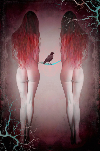
I have to admit I do like Symmetry in my work which is probably why I create mostly square images. This one on the other hand I thought would benefit from being a rectangle as I figured it would make the symmetry, mirror and central, stand out a little more. Anyhow, I'm pleased with how it turned out and I love the contrasting colours.
Like most of my work there is a little of the story of my own life behind this image but I'd rather not explain this one and just let the symbolism of it speak for itself.
Today I find myself with a bit of a dilemma. I'm four images away from reaching 1,000 images which I've created for my personal portfolio. I'd really prefer to work on some images I've saved from shoots that I've done in the past and reach that 1,000 image goal over the next couple of days but I have two commissions I know I should be getting on with.....
Decisions, decisions.......
No comments:
Post a Comment